-
-
宋宋 数据领袖Lv6
发表于2020-3-17 18:48
楼主
本帖最后由 宋宋 于 2020-3-18 19:44 编辑
提要:
1. plotly:
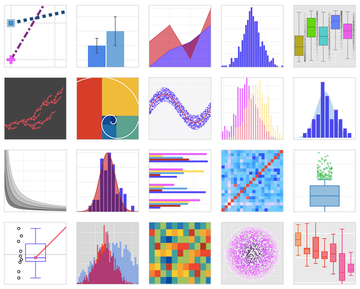
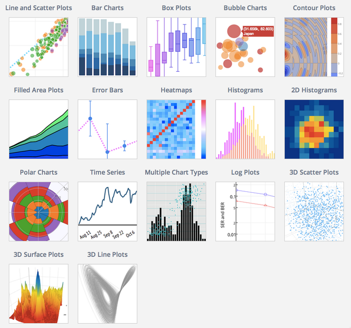
更多gallery链接:plotly
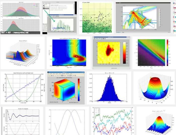
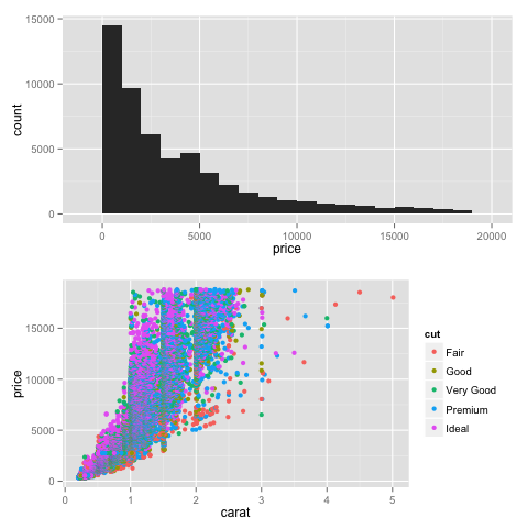
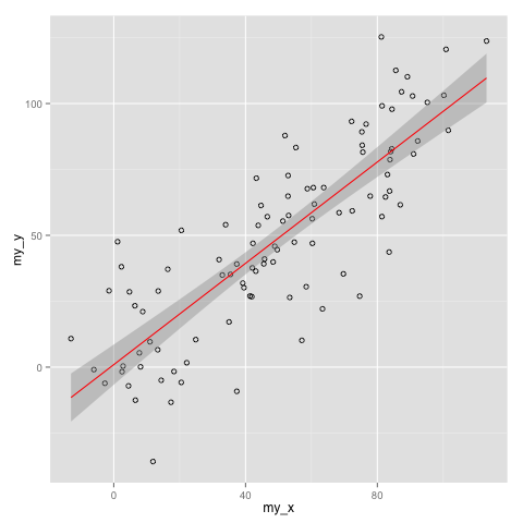
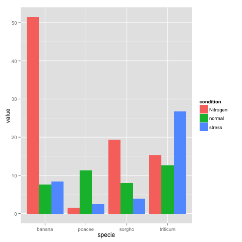
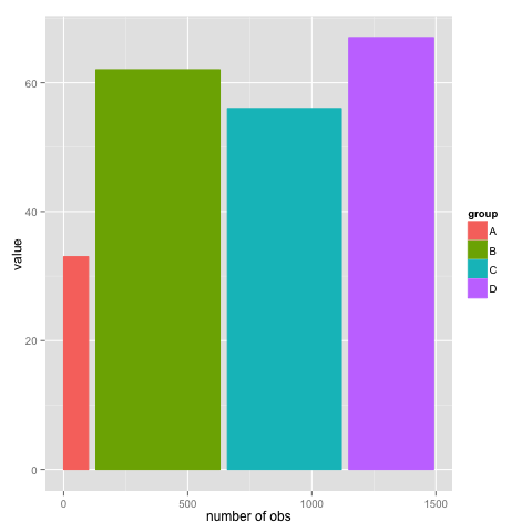
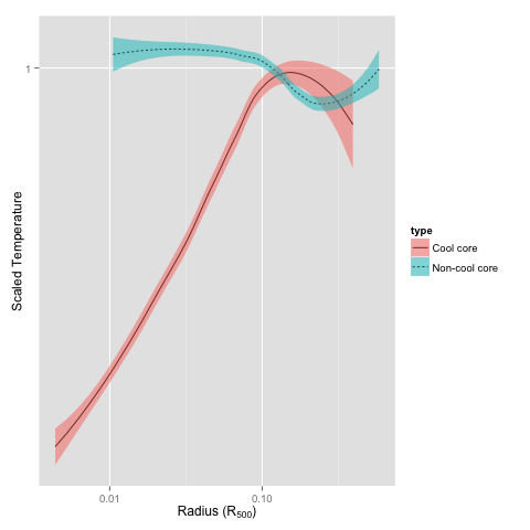
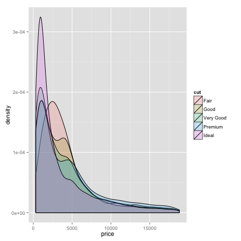
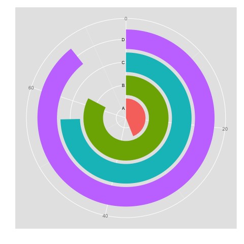
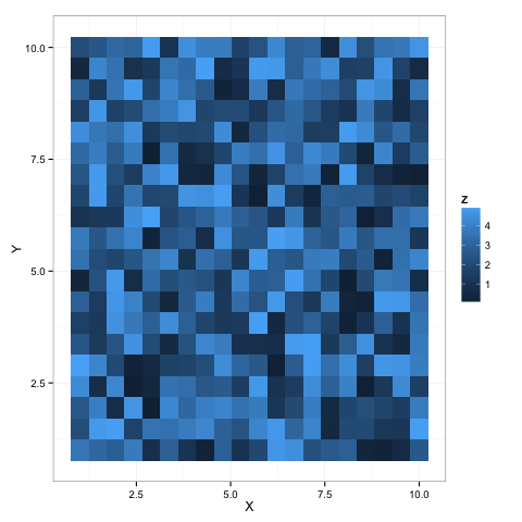
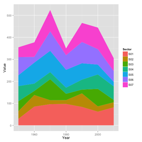
2. R ggplot2:

3. 无需编程语言的工具:01. 亿信ABI
02. Raw
Raw is an open web app with a simple interface
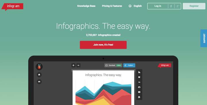
03. Infogram
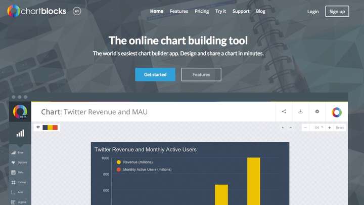
04. ChartBlocks
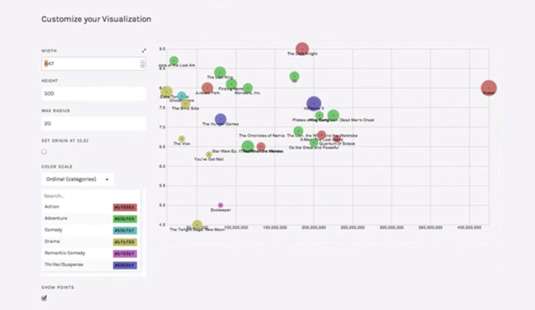
05. Visualize Free

Make visualizations for free!
06. Visual.ly
 http://
Visual.ly makes data visualisation as simple as can be
07. iCharts
iCharts can have interactive elements, and you can pull in data from Google Docs
4. 基于JavaScript实现的工具:
01. Chart.js
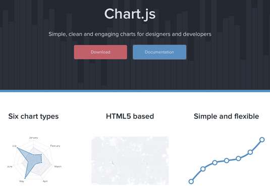
Chart.js is perfectly suited to smaller projects
02. D3.js
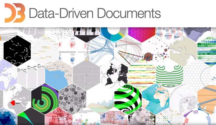
You can render some amazing diagrams with D3
03. FusionCharts
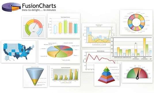
A comprehensive JavaScript/HTML5 charting solution for your data visualization needs
04. JavaScript InfoVis Toolkit
JavaScript InfoVis Toolkit includes a handy modular structure
05. jQuery Visualize
jQuery Visualize Plugin is an open source charting plugin
06. ZingChart
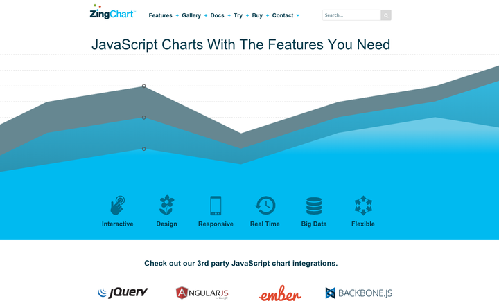
ZingChart lets you create HTML5 Canvas charts and more
07. Flot
Create animated visualisations with this jQuery plugin
08. Gephi
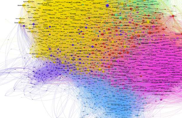
Gephi in action. Coloured regions represent clusters of data that the system is guessing are similar5. 基于其他语言实现的工具:
#PHP
01. jpGraph
jpGraph is a PHP-based data visualization tool
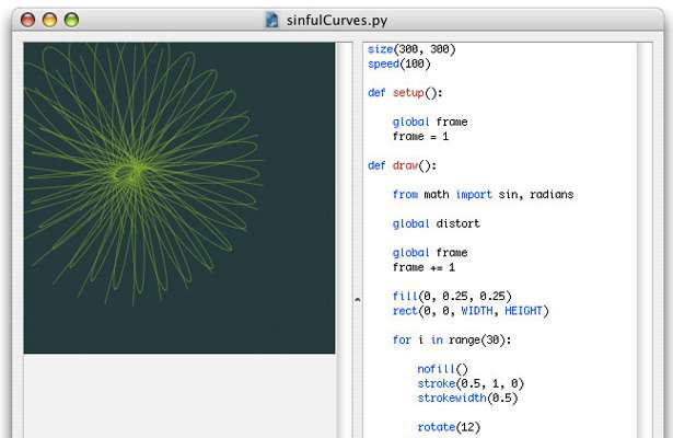
02. Processing

Processing provides a cross-platform environment for creating images, animations, and interactions
03. NodeBox
NodeBox is a quick, easy way for Python-savvy developers to create 2D visualisations
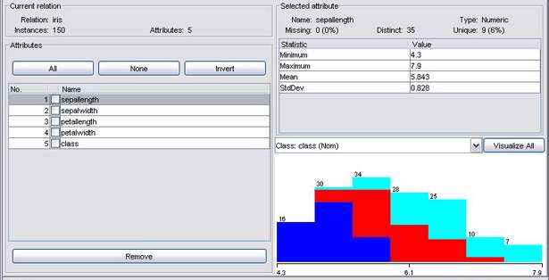
04. R
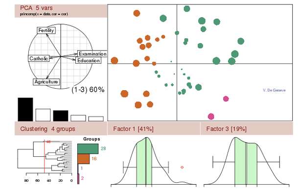
A powerful free software environment for statistical computing and graphics, R is the most complex of the tools listed here
#Weka
05. Weka
A collection of machine-learning algorithms for data-mining tasks, Weka is a powerful way to explore data
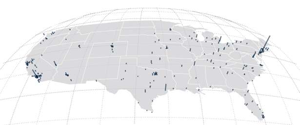
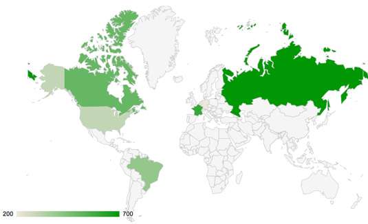
6. 地图数据可视化的工具:
01. CartoDB
CartoDB provides an unparalleled way to combine maps and tabular data to create visualisations
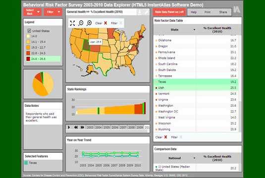
02. InstantAtlas
InstantAtlas enables you to create highly engaging visualisations around map data
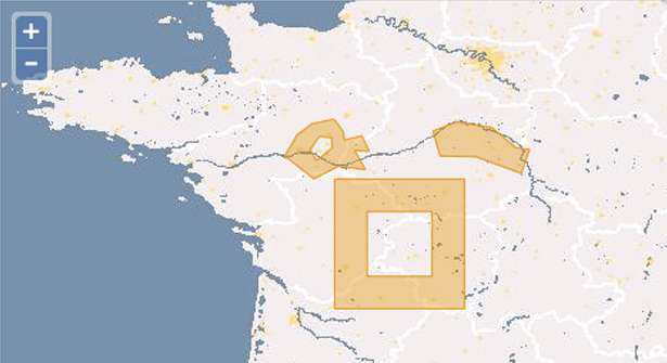
03. Polymaps
Aimed more at specialist data visualisers, the Polymaps library creates image and vector-tiled maps using SVG
04. OpenLayers
It isn't easy to master, but OpenLayers is arguably the most complete, robust mapping solution discussed here
05. Kartograph
Kartograph's projections breathe new life into our standard slippy maps
06. Exhibit
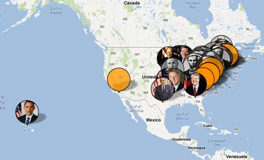
Exhibit makes data visualization a doddle
07. Modest Maps
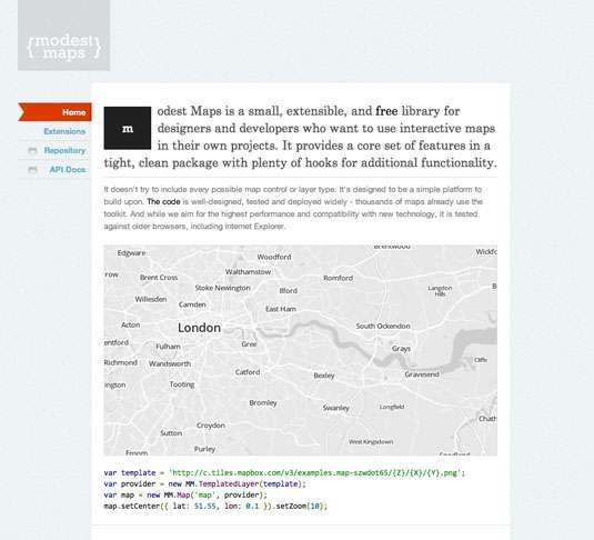
Integrate and develop interactive maps within your site with this cool tool
08. Leaflet
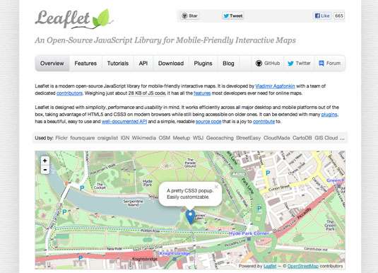
Use OpenStreetMap data and integrate data visualisation in an HTML5/CSS3 wrapper
7. 金融数据可视化的工具:
01. Dygraphs
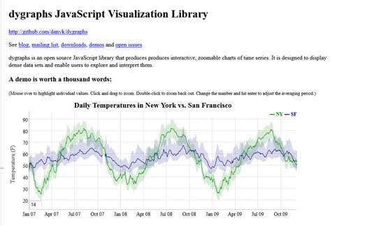
Help visitors explore dense data sets with JavaScript library Dygraphs
02. Highcharts
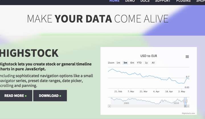
Highcharts has a huge range of options available
8. 时间轴数据可视化工具:
01. Timeline
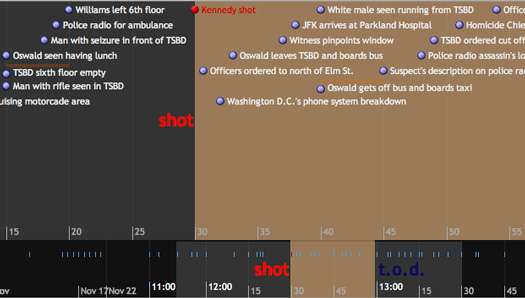
Timeline creates beautiful interactive visualizations
02. Dipity
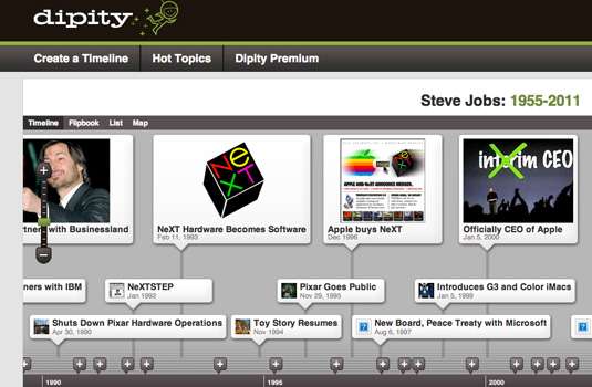
Dipity has free and premium versions to suit your needs
9. 函数公式数据可视化工具
01. WolframAlpha
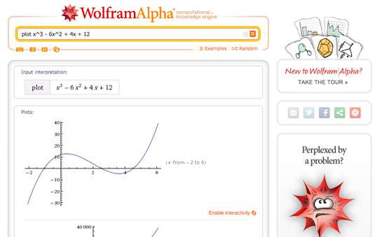
Wolfram Alpha is excellent at creating charts
02. Tangle
Tangle creates complex interactive graphics. Pulling on any one of the knobs affects data throughout all of the linked charts. This creates a real-time feedback loop, enabling you to understand complex equations in a more intuitive way
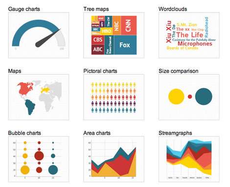
8. 其他:
01. Better World Flux
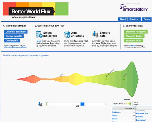
Making the ugly beautiful - that's Better World Flux
02. Google Charts
Google Charts has an excellent selection of tools available
03. Crossfilter
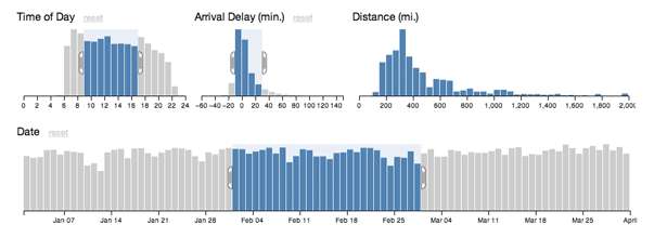
Crossfilter in action: by restricting the input range on any one chart, data is affected everywhere.
来源互联网
提要:
- plotly
- R ggplot2
- 无需编程语言的工具(7个)
- 基于JavaScript实现的工具(8个)
- 基于其他语言的工具(5个)
- 地图数据可视化工具(8个)
- 金融(股票)数据可视化工具(2个)
- 时间轴数据可视化工具(2个)
- 函数与公式数据可视化工具(2个)
- 其他(3个)
1. plotly:
更多gallery链接:plotly
2. R ggplot2:
3. 无需编程语言的工具:01. 亿信ABI
02. Raw
Raw is an open web app with a simple interface
03. Infogram
Infogram enables you to create both charts and infographics online
04. ChartBlocks
ChartBlocks is another online chart builder
05. Visualize Free
Make visualizations for free!
06. Visual.ly
http://Visual.ly makes data visualisation as simple as can be
07. iCharts
iCharts can have interactive elements, and you can pull in data from Google Docs
4. 基于JavaScript实现的工具:
01. Chart.js
Chart.js is perfectly suited to smaller projects
02. D3.js
You can render some amazing diagrams with D3
03. FusionCharts
A comprehensive JavaScript/HTML5 charting solution for your data visualization needs
04. JavaScript InfoVis Toolkit
JavaScript InfoVis Toolkit includes a handy modular structure
05. jQuery Visualize
jQuery Visualize Plugin is an open source charting plugin
06. ZingChart
ZingChart lets you create HTML5 Canvas charts and more
07. Flot
Create animated visualisations with this jQuery plugin
08. Gephi
Gephi in action. Coloured regions represent clusters of data that the system is guessing are similar5. 基于其他语言实现的工具:
#PHP
01. jpGraph
jpGraph is a PHP-based data visualization tool
#JAVA
02. Processing
Processing provides a cross-platform environment for creating images, animations, and interactions
#Python
03. NodeBox
NodeBox is a quick, easy way for Python-savvy developers to create 2D visualisations
#R
04. R
A powerful free software environment for statistical computing and graphics, R is the most complex of the tools listed here
#Weka
05. Weka
A collection of machine-learning algorithms for data-mining tasks, Weka is a powerful way to explore data
6. 地图数据可视化的工具:
01. CartoDB
CartoDB provides an unparalleled way to combine maps and tabular data to create visualisations
02. InstantAtlas
InstantAtlas enables you to create highly engaging visualisations around map data
03. Polymaps
Aimed more at specialist data visualisers, the Polymaps library creates image and vector-tiled maps using SVG
04. OpenLayers
It isn't easy to master, but OpenLayers is arguably the most complete, robust mapping solution discussed here
05. Kartograph
Kartograph's projections breathe new life into our standard slippy maps
06. Exhibit
Exhibit makes data visualization a doddle
07. Modest Maps
Integrate and develop interactive maps within your site with this cool tool
08. Leaflet
Use OpenStreetMap data and integrate data visualisation in an HTML5/CSS3 wrapper
7. 金融数据可视化的工具:
01. Dygraphs
Help visitors explore dense data sets with JavaScript library Dygraphs
02. Highcharts
Highcharts has a huge range of options available
8. 时间轴数据可视化工具:
01. Timeline
Timeline creates beautiful interactive visualizations
02. Dipity
Dipity has free and premium versions to suit your needs
9. 函数公式数据可视化工具
01. WolframAlpha
Wolfram Alpha is excellent at creating charts
02. Tangle
Tangle creates complex interactive graphics. Pulling on any one of the knobs affects data throughout all of the linked charts. This creates a real-time feedback loop, enabling you to understand complex equations in a more intuitive way
8. 其他:
01. Better World Flux
Making the ugly beautiful - that's Better World Flux
02. Google Charts
Google Charts has an excellent selection of tools available
03. Crossfilter
Crossfilter in action: by restricting the input range on any one chart, data is affected everywhere.
来源互联网